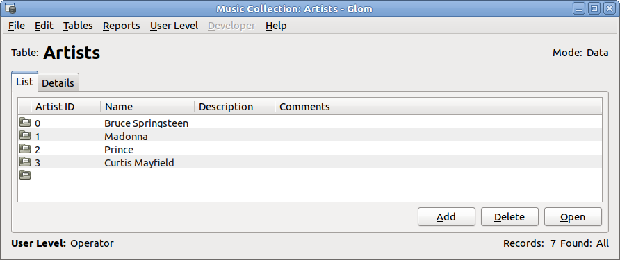
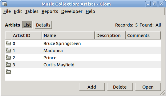
As planned, I have made the main Glom window even simpler. I’ve moved the table title down next to the “notebook” tabs, moved the records count up to the top. I’ve hidden the “mode” concept because it’s now just a matter of whether you are entering find criteria or not. I’ve also removed the User Level menu, moving it’s toggle menu items to the top of the Developer menu, and I removed the User Level label, hoping that people don’t need that clue.
Before: Glom 1.18:
After: Glom 1.19/20:
(There are other differences between GTK+ 2, used by Glom 1.18, and GTK+ 3, used by Glom 1.19/20, and theme differences.)
Notice also that by using the custom-notebook widget, instead of GtkNotebook, the window does not need to be as wide as the widest notebook page even when that page is not actually showing.
This is in git master. I’ll do a new release when the dependencies get the tarball releases that I need. It will also fix the Find feature, which seems to have been broken in various ways since Glom 1.16.


It does break a few UI expectations? The tabs looks like buttons and not tabs.
What about a new ‘inspector’ window that shows the details when open and still allows navigating using the list view. Navigating the list view changes the detail window. Just like rhythmbox? This would also allow the button, to be a real button next to “Add,delete,open”, as it opens a new dialog instead of changing the existing view. Anther option would be an icon shown inline that can be hovered and activated.
Just make sure that the detail window is always shown, when the list views is active (WM), and vice versa. This avoids the problem of disappearing windows for SDI interfaces like Gimp.
Sorry for rambling ;)
> The tabs looks like buttons and not tabs.
I can use notebook tabs again when this GTK+ bug/request is fixed sometime: https://bugzilla.gnome.org/show_bug.cgi?id=123408 . Until then, GtkNotebook wastes too much space when it fills the whole window width. See my previous post about this, linked here.
> What about a new ‘inspector’ window
I would prefer not to open a secondary window. That makes the UI more complicated. And having 2 windows visible will just use more of the screen, though I’m trying to use less. And it would mean we have to worry about what to do when the user clicks a related record – should we then have 3 windows? That won’t work.