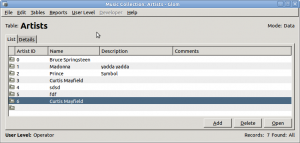
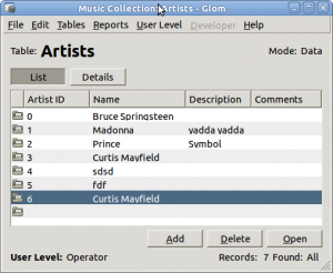
GtkNotebook has a frame around the page that it shows, grouping that page’s widgets together. That makes sense when the notebook is part of a more complicated UI. But Glom uses a GtkNotebook for almost all of its main window, taking up all of the window’s width. The frame needs an inner border that wastes space and the nesting actually makes the UI look more complicated than it is.
That frame is not optional in GtkNotebook, so I had to create a custom Gtk::Notebook-like class to replace it in my code. The result is mostly better, though I don’t like those two toggle buttons much. Suggestions are welcome.
I will also move those top labels around, putting them in the same row as the List and Details toggle buttons, but this is a start.


If you only ever have two “tabs”, why do you need *two* toggle buttons? A single one should be enough to toggle between the two states?
Hi Murray!
You probably want to look into my AnjutaTabber widget that actually renders real notebook tabs:
http://git.gnome.org/browse/anjuta/tree/libanjuta/anjuta-tabber.h
(Sorry, redering in master it is a bit broken atm but I will fix that ASAP)
Screenshot: http://blogs.gnome.org/johannes/2010/04/05/re-anjuta-ui-work/
Regards,
Johannes
Ooh. Does it even use the same theme styling as regular GtkNotebook tabs?
Alexander, so the title of the toggle button would change depending on it’s state? That feels rather strange, and it wouldn’t be obvious what would happen when the button is clicked.
Of course, just removing the tabs completely is a real option. People can click on list rows to get to details.
Though then they would need a way to get back to the list view.
Like this? http://www.glom.org/wiki/index.php?title=Development/UIReview#Proposal
It also just occurred to me that this is a pretty similar layout to most email clients. You have a list of objects, you reach the details page by clicking on the object, and then you have “back” navigation as well as (usually) “next item” and “previous item”. I don’t think that “Back to List” is confusing in this case at all.
Yes, it could be best, though I can’t think of quite the right title and placement for a “show list” button. I still think that “back” is the wrong idea because there are so many other ways to get to the details view, and this “back” would not always take you back.
Got a screenshot of an email client that does this without using the idea of back?
It could be context sensitive, showing “Back to List” only when the user actually navigated from a list at some point, and a more generic term in other cases. Or just always use the generic term (e.g. “Go to List”, or “Show All”). It may be difficult to find the ideal terminology, but I think that the logic is right and easy to understand. Do you have a definite list of circumstances under which the user would end up on a details view without going through the list?
As for email clients, all of those I have either use the “Back” terminology (Gmail, Maemo) or open detailled mail views in a new window or tab (Evolution, Mail.app, although those also show details on the main view). Outlook Webmail has a “Close” item in the toolbar, which works similar to the new window behaviour, just without an actual new window.
You can end up on a list view in these ways, at least:
1. You clicked on the List tab.
2. You navigated to a table which you last viewed as list.
3. You did a search that had multiple results.
4. Possibly others.
I think that’s enough ways to make it feel non-deterministic for the user if we try to be clever about it.
So there are essentially two exceptions (so far):
2) I don’t think that this is an issue, because the “Back to list” in this case would be relative to the table. The user must have navigated from the list view of that table to get to the detail view, so the back link still makes sense. I highly doubt that any user would be confused by this behaviour.
If anything, I believe that confusion can arise in general from the view switching after navigating between tables, and there might be an argument for always returning to the list when navigating to a different table. But if the current behaviour is significantly more efficient in some cases, it may well outweigh that minor potential for confusion.
3) In this case, it would seem natural to me if the back button would return to the list of search results. E.g. Gmail will do just that and call the back link “Back to Search Results” in that case.
More challenging though could be the question of what happens if the user opens an item from a related table widget. A cop-out to that would be if those items would be opened in a new window instead. I don’t remember how that works in Glom right now. Even in that case I don’t see an issue with always going back to the table’s list though, it just has to be worded carefully.
I don’t know how the details look, so its hard for me to really say. But, does a “show details” togglebutton really have to change name when its active? You can tell the state from the state of the togglebutton. Not that I think its an ideal UI, but it might be worth testing.
I don’t think it’s quite appropriate. List-view-or-not is more worth emphasizing, but it’s an interesting idea. Thanks.
This is what details looks like:
http://www.glom.org/wiki/index.php?title=Screenshots#The_Details_View
I’ve always been annoyed by the visible frame shown in gnome-terminal with multiple tabs open; that would also be GtkNotebook. In my opinion gnome-terminal looks much more slick if it only has one tab open which makes the frame disappear.
For that simpler case, this hack might work: http://twitter.com/#!/vwduder/status/43790065431875584 . It seems to just remove some spacing for me, without removing the actual frame lines.
I’m not sure if this GtkNotebook bug is about that spacing or about the frame: https://bugzilla.gnome.org/show_bug.cgi?id=123408
Do you know what the current status of this is?
It looks like gnome terminal no longer has the frame, but I still can’t seem to disable it in glade?
In Ubuntu they’re building a new widget for this it seems:
http://farm6.static.flickr.com/5254/5486719859_af8cfb0024_o.jpg
That’s 100% copied from OS X !
Can’t this situation be salvaged with the regular GtkNotebook.. either align the table and notebook borders on top of each other or the notebook and window borders.
Practically all of our UI controls are 100% copied from somewhere else. Ubuntu generally seems to be going with the OSX design when in doubt, and there is nothing wrong with it (as long as its somewhat consistent).
This is what we do in PyChess: http://imgur.com/lThW0
That is, having two notebooks, one over the other, linked together. It works really well actually, you don’t think about it at all when you use the program.
I think gtk needs to find a real solution, since it is obviously something many programs are struggling with.
Personally, I think that the change hinders usability.
In the first screenshot, the frame indicates to the user that both the list and the buttons near the bottom are part of the tab. The button placement indicates to the user that the buttons relate to the list.
In the second screenshot (the frameless GtkNotebook), it is not clear (just by looking at the interface) what clicking “Details” will do. Furthermore, even if the user assumes that clicking “Details” will change the tab, it is not clear whether the “Add”, “Delete” and “Open” buttons near the bottom are part of the tab or not part of the tab. So it is not immediately evident if clicking “Details” will alter just the list or the list as well as the buttons.
> So it is not immediately evident if clicking “Details†will alter just the list or the list as well as the buttons.
I understand, but I don’t think that’s a major issue in this case. The user will soon see what happens and the user is unlikely to worry about that.
Sory for the stupid question, but what’s the matter with NoteBook, its tabs and frame?
It’s probably not realy “sexy”, but quite cleaver.
Please read the blog post above.