In Ubuntu Feisty, my new file manager folder windows have a name column that’s too small to show any text. I wonder, is this an Ubuntu Feisty-specific bug, or something that has arrived in generic GNOME 2.17/2.18. I think it’s a show-stopper for either Ubuntu or GNOME.
 Update: This is fixed now, after the latest Feisty update, so it will not be a problem in the final release.
works for me (up to date feisty)
Isn’t it the “Date Modified”-column, what’s using too much space?
Is it necessary to spend so much space for date+time?
How about:
“Date Modified”
28.02.2007 21:45
03.03.2007 18:12
Or, perhaps, if the window get’s smaller some more:
Decrease the width of the date-column to only show the date and cut off the time:
“Modified”
28.02.2007…
Btw, the the date-format configurable to the users need?
Best regards…
you can change the format in the preferences>display.
the smallest available is “2007-12-24 11:11:11”.
Being able to resize those columns at all seems pointless to me. Either you want to see the data or you don’t. If the data is unreasonable long, it should be ellipsed with a hover expand. We should just remove the ability to resize them, and make them sized right all the time.
Works fine for me with nautilus svn from a couple days ago. Also, isn’t “list as icons” default, making the bug only appear for a subset of users? Or has Ubuntu changed the default?
I had the same problem. But now I have changed the settings in Preferences/List Columns and the problem is gone [maybe nautilus doesn’t recognize the old settings correctly?].
I’m guessing it’s only a bug in spatial nautilus?
Elijah, yes Icons is the default, which makes it just slightly less awful. Browse-mode (with icons) is the default on Ubuntu, but that’s another problem.
Raf, this is on a fresh install of Ubuntu Feisty after a hard drive failure.
Andy, yes, as mentioned in the bug reports.
Jerome, resizing of the name column will always be necessary, but, yes, I think that’s a good idea about the other columns. Smart thinking.
I disagree about the all or nothing approach for the date column. One of the (few) things that the OS X Finder gets absolutely right is that it changes the content of the Date column to be more terse/verbose as the space available expands. Compare “1/23/07” with “Tuesday, January 23, 2007 at 4:56 p.m.” — the former is far more useful than “Tues…” would be if the latter format would always used, regardless of space. It will drop to … when there is not enough space for MM/DD/YY.
I think that’s what they do to make it compatible to 800×600 screen resolutions.
It happens too on File Chooser, where you can’t see the files, unless they have small fonts.
It seems that the patch is not really intuitive, even the 800×600 users could not find it useful.
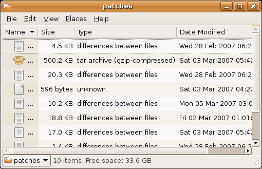
That’s not a name that’s a picture. The picture describes the type, maybe it shouldn’t be forced into the name column at all?
What’s with the dead space to the left of the icon?
Very odd.
The name column is the only one that resizes. If the window is too small to show all the columns, the name column is squeezed. If you make the window bigger or remove some columns, the full name field is shown.
The name column is probably the worst choice…
I think your problem should actually be fixed by now:
”
2007-02-21 Christian Persch
* src/file-manager/fm-list-view.c: (create_and_set_up_tree_view):
Ellipsise the filename column in list view mode, and make it expand so
it doesn’t just show “…”.
“
this issue also cropped up in all my fedora 6 and 7 boxes in the past week or so. ;-p